Personal Properties and Settings
Customize Your Personal Properties
Via the action in the Main Action Bar you can open your personal properties page.
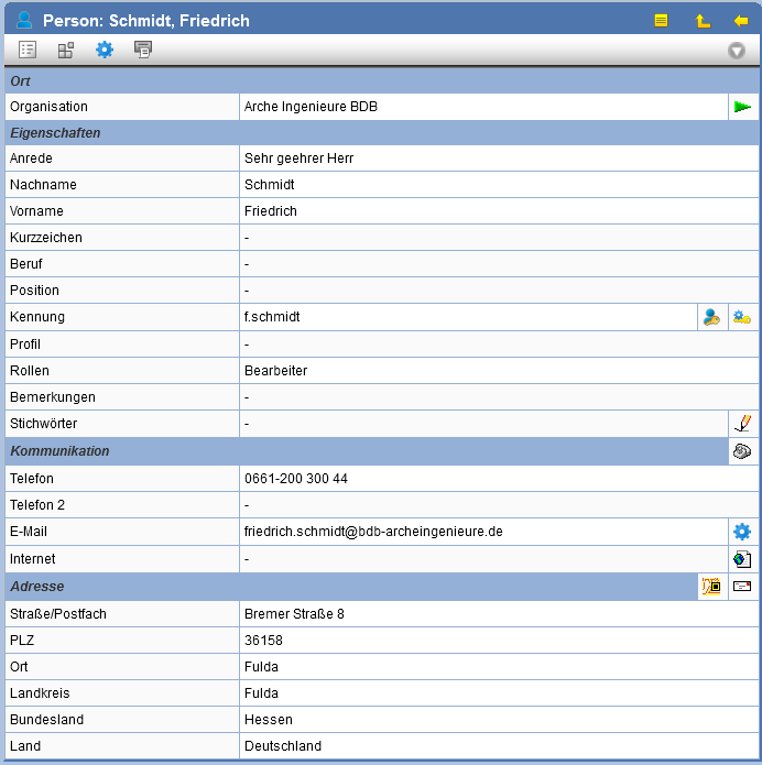
The following actions are available:
| Change Properties | |
| Using this button, you can view the registration data for a person. When and by whom was the person registered? When and by whom were the entries last modified? | |
| Change Personal Settings | |
| With this action, project managers and project administrators can copy persons to the Clipboard to subsequently add them as members to projects. | |
| Lists all memberships in projects | |
| Print Person Properties | |
| Password change | |
| Two-Factor Authentication enable | |
| Keywords assign | |
| Change communication data such as telephone, fax, and email | |
| Set Email Signature | |
| Open Website | |
| Change address data such as street and city | |
| Using this symbol, if configured, you can set the address to maps.google.de. |
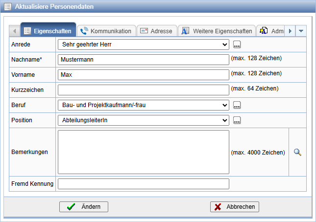
The dialog for adjusting properties is divided into various tabs. Thus, here in addition to the adjustment of basic data, such as salutation or name, also the processing of communication and address data can take place.
Configuring the Email Signature
The email signature supplements the text of an email with individual details such as contact information or legal notices and is automatically appended to sent emails. To embed it, the signature must be available in the form of an HTML file.
To configure the signature, press on the personal properties page on the icon next to the E-mail field.
Now press Search, to select the file with the signature.
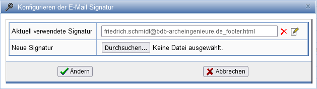
After you have selected a signature, it will be copied to the server and will now be available after pressing Change available. Via the action area . The signature can be adjusted. The signature can be via the action
can be removed again.
Personal Settings
With the personal settings, you can adjust the appearance and behavior of the interface to a limited extent.
To change personal settings, select the action in the Actions bar on the Properties page of your person or at the main node of any component .
Activate or deactivate the desired settings and confirm them with Change.
The following options are available in the area General available:
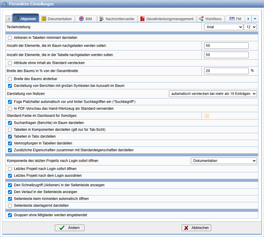
| Text Settings | Here, the font and size of the PlanTeam-SPACE interface can be set individually. |
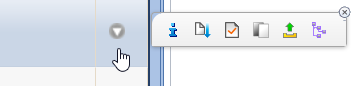
| Minimize actions in tables | Instead of all available actions, only the icon is shown in tables  displayed in the Action column. Only when you move the mouse pointer to the corresponding row does a menu with the available
actions open. The menu can be temporarily hidden via "x" and re-displayed using the action
again.
displayed in the Action column. Only when you move the mouse pointer to the corresponding row does a menu with the available
actions open. The menu can be temporarily hidden via "x" and re-displayed using the action
again.
|
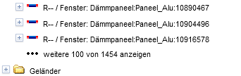
| Number of elements to be loaded into the tree | Not all elements of a tree are displayed directly. Here you can specify how many
elements should be loaded when expanding the tree at the bottom. The value can range between 1 and 1000.
 |
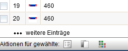
| Number of elements to be loaded into the table | Not all elements of a table are displayed directly. Here you can specify how many
elements should be loaded when expanding the table at the bottom. The value can range between 1 and 1000.
 |
| Hide attributes without content by default | Unassigned attributes are not displayed on the property page. Hidden attributes can be made visible at any time. |
| Display reports in the tree | Existing search reports are displayed in the individual trees. |
| Width of the tree as % of total width | Default setting for the proportion of the tree's width in percent of the total width. The value must be between 0 and 100. This setting is only used if the width of the tree is changeable. |
| Tree width changeable | When this option is enabled, the width of the tree can be adjusted
via a slider according to your requirements.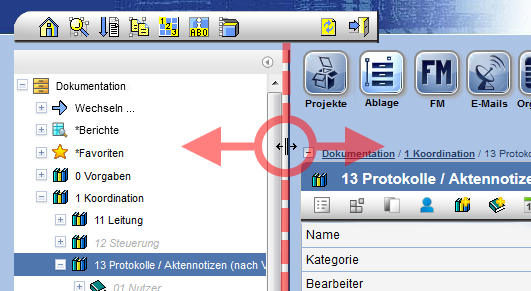
|
| Display of reports with large icons upon selection in the tree | When this option is enabled, reports selected via the tree (see the necessary option above) will be displayed as follows instead of the usual table:
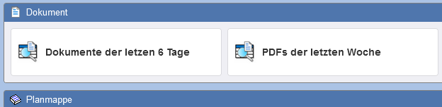
|
| Display of notes | The selection available here determines whether notes, which are available for a variety of objects, are shown or hidden. |
| Automatically insert placeholders before and after search terms (*search term*) | This treats all search terms as if they were preceded and followed by the length-independent placeholder *. Thus, for example, when searching for Saxony the results also include Saxony-Anhalt and Lower Saxony. |
| Use Hand tool as default in PDF preview | In PDF preview, the text selection tool is normally pre-selected. With this option, the Hand tool, for moving the view, is selected directly upon opening instead. |
| Default color in Dashboard for Others: | This determines the color in which the tiles of this component appear when added to the Dashboard can be added. Afterwards, the colors of the individual tiles can still be adjusted individually. |
| Display tables as components (applies only to tab view) | When enabled, tables are displayed as sub-tabs of the associated components. |
| Display tables in tabs | When enabled, tables are displayed one after another instead of below each other on the property pages.
This can speed up the page layout.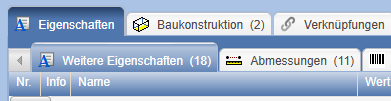
|
| Display additional properties together with standard properties | With this option, further properties are displayed in tabs at the top of the property pages; otherwise, they can be found together with
the tables at the bottom of the property pages.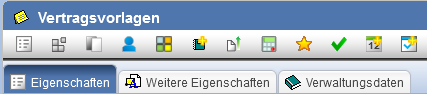
|
| Display links in tables | When enabled, the links of objects on the respective property page are displayed in a table.
Disabling the option can speed up the page layout.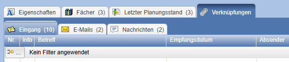
|
| Open last project after login | The project you last used before logging off will be automatically reopened upon the next login. With Open component of last project immediately after login you can specify which area of the project should be opened automatically. The following options are available: PlanOrganizer (schedule and task overview), PlanManager (documentation), PlanExchange (message center) and SpaceManager (FM). |
| Show Quick Access (Actions) in the sidebar | The right sidebar contains the card Quick Access when the option is selected. |
| Show History in the sidebar | The right sidebar contains the card History. when the option is selected. |
| Automatically open sidebar when logging in | The sidebar can generally be displayed expanded, provided this option is active. |
| Display sidebar overlapping | The side clipboard can be displayed overlapping. This means that the current PTS window is not changed and the side clipboard is fanned out over it. Alternatively, the side clipboard can reduce the display of the PTS window so far that sufficient space is available. |
| Groups without members are shown | If this option is not set, empty groups are not displayed in the project overview under "Groups and Members". |
The following options are available in the area Documentation:
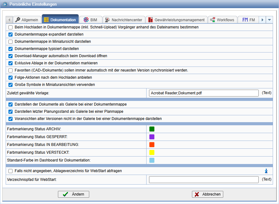
| Determine predecessor based on filename when uploading to document folder (including Quick Upload) | Predecessor |
| Display document folders expanded | Table entries in document folders are displayed expanded by default when the option is active. |
| Display document folders with types | Changes the display of Document folders. |
| Display document folders in thumbnail view | When the option is activated, documents in document folders are displayed in thumbnail view by default. You can switch to list view afterwards. |
| Automatically open download manager during download | With the download manager, you maintain an overview of your downloads when downloading larger data volumes. |
| Mark exclusive storage in documentation | In the documentation, all areas are specifically
marked where only persons from your own organization
have access. The organization must be linked to a group with exclusive access. Additionally, there must be a project manager. |
| Use large icons in thumbnail views | When the option is activated, documents in the thumbnail view shown enlarged. Otherwise, they are visible as small. |
| Display documents as a gallery in a document folder | If the option is activated, documents in document folders can be displayed as a gallery. If the option is not activated, only the list view is available. |
| Display last planning status as a gallery in a plan folder | If the option is activated, the last planning status in plan folders can be displayed as a gallery. If the option is not activated, only the list view is available. |
| Do not display previews of old versions in the gallery of a document folder | If multiple versions of a document are contained in a document folder, with the option activated, only the latest version is displayed in the gallery. |
| Color markings | Configuration of the color representation of storage locations and documents depending on the status. |
| Storage directory for WebStart | Here you can define a personal storage location for the WebStart application, which enables direct editing of (CAD) documents. Optionally, you will be prompted for the path upon each start of the action. |
The following options are available in the area Message Center available:
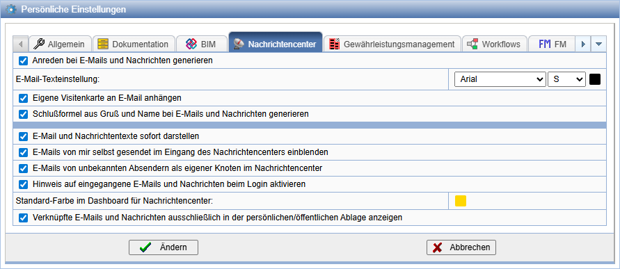
| Generate salutations for emails and messages | Depending on the selected recipients, salutations are automatically added to the email or message. |
| Email text settings | Here you can select default settings regarding size and font for the email editor. |
| Generate closing formula from greeting and name for emails and messages | If the option is active, a closing formula is automatically appended to the end of the message text. |
| Display emails sent by myself in the inbox of the message center | Emails authored by you are displayed in the inbox of the message center. |
| Display emails from unknown senders as a separate node in the Message Center | For better overview, emails from unknown senders are sorted into a separate node. |
| Attach your own business card to email | If the option is activated, your contact information in VCF format is sent along with emails when sending. |
| Activate notification of incoming messages at login | If you have received new messages, you will be informed about them upon login. |
| Display message texts immediately | Messages are always displayed with the text field expanded. |
| Show linked emails and messages only in the personal inbox | When this option is enabled, emails and messages located in your personal inbox are displayed only within that inbox. |
The following options are available in the Workflows area:
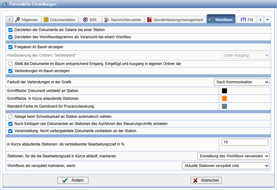
| Display documents as a gallery at a station | Documents are displayed as a gallery under the properties of a station. |
| Display the workflow diagram as a preview for a workflow | The workflow diagram is displayed in the gallery on the properties page of the respective workflow. |
| Color code: Document remains at station | Specify the color for documents that remain at a station. |
| Show approvals in the tree | Approvals for documents and stations are displayed in the tree.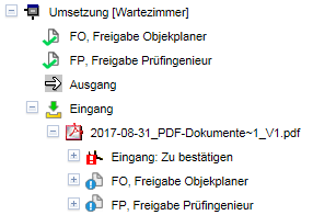 |
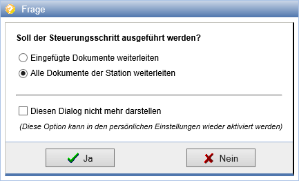
| Offer execution of the control step after inserting documents at stations | If a document is subsequently linked to a station via the clipboard or upload, the execution of the control step is automatically offered.
Here, you can differentiate whether all documents or only the newly linked documents should be passed over.
 |
| Show connections in the tree | Under a station, the connections to subsequent stations are displayed.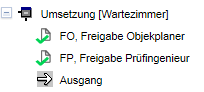 |
| Mark delayed workflows in red in the tree when: | You can decide from when a delayed workflow should be marked in red. The options are Never, Current stations are delayed and Current or completed stations are delayed. |
| Default: Documents not forwarded should remain at the station after the control step | If documents are not forwarded during a control step, they remain at the previous station. They can be further processed here and optionally forwarded subsequently. |
| Display documents at stations structured in the tree (Inbox, Inserted, Outbox) | Upon selection, documents in the tree are placed into the three folders Inbox, Inserted and Output sorted. Otherwise, they are located directly below the workflow. |
| Positioning of the folder "Remaining" | The folder Remaining can be displayed under the Output, Input or on the same level. |
The following options are available in the area BIM ( the same settings can also be changed locally in the BIM-Viewer):
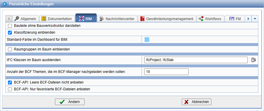
| Display components without building structure | When this option is enabled, objects are shown directly in the tree view in the BIM-Viewer without the building structure. |
| Show classification | Displays components in the tree view of the BIM-Viewer separately according to their category. |
| Standard color for BIM in the dashboard | Here, the color for the information blocks in the dashboard for the BIM component is set. |
| Hide IFC classes | Specify exactly which category classes should be displayed in the tree of the BIM component. You will find the correct name on their property pages. |
| Number of BCF topics to reload in the BCF Manager | If a BCF file contains a very large number of topics, only as many topics are loaded upon opening as defined here. |
| BCF-API: Do not offer empty BCF files | Empty BCF files are not displayed via the BCF interface. |
| BCF-API: Only offer favorite BCF files | Only favorite BCF files are displayed with the BCF interface. |
The following options are available in the Organizer area:
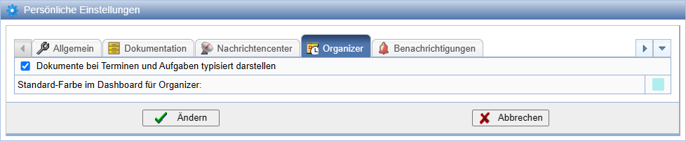
| Represent documents linked to appointments and tasks by type | Documents linked to an appointment or task are grouped by document type and displayed on the properties page. |
| Default color in the dashboard for Organizer | Here, the color for the information blocks in the Organizer's dashboard is set. |
The following options are available in the Notifications area:
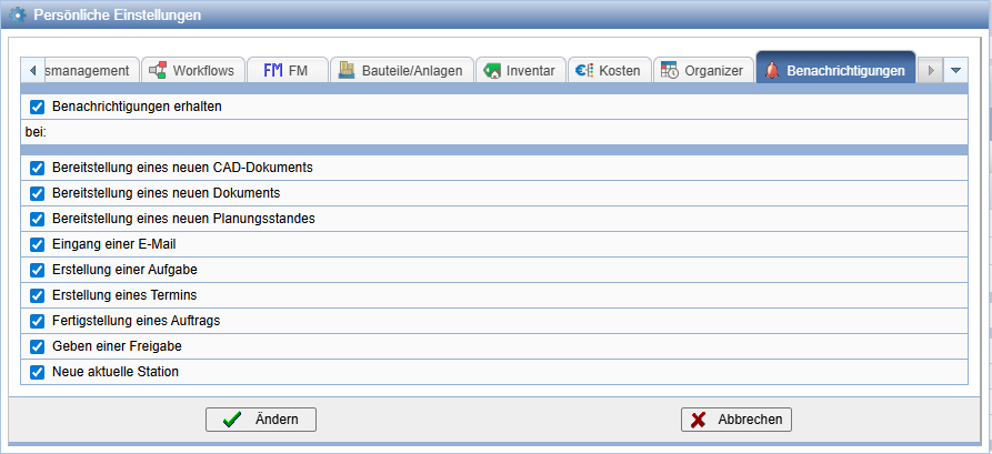
| Receive notifications when: | When selected, notifications are enabled |
| Release of a new CAD document | When selected, notification upon Import of a CAD document |
| Release of a new document | When selected, notification upon Import of a document |
| Release of a new revision level | When selected, notification upon new revision level |
| Receipt of an email | When selected, notification upon Email receipt |
| Creation of a task | When selected, notification upon Task creation |
| Creation of an appointment | On selection notification at Appointment creation |
| Completion of an order | On selection notification at Completion of an order |
| Issuance of a release | On selection notification at Assignment of a release |
| New current station | On selection notification at the Arrival at a station with involvement |